The Alluring Nothing Phone 2a Blue Edition: A Closer Look
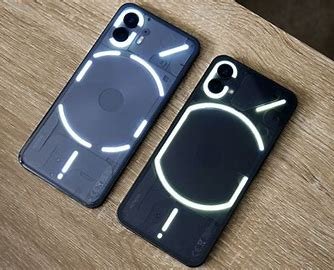
Nothing Phone 2a Blue Edition
The Nothing Phone 2a has been making waves in the smartphone market, and its latest variant is bound to turn heads. Say hello to the Nothing Phone 2a Blue Edition, an exclusive colorway launched in India. Let’s dive into the details of this captivating device.
A Splash of Blue
As you can see in the photos, the new Blue Edition is a combination of a dark indigo color and a light tone of blue (ash blue, to be precise). Nothing’s iconic Glyph Interface is present, sitting cozily in its three-striped glory in the new blue shade. The plastic frame is brushed in the same blue hue, while the black volume buttons and power button add a subtle contrast. Nothing pays attention to detail, even down to the branding and CE marking on the Phone 2a’s back, which are in ash blue (whitish) color.
A Balanced Choice
Compared to the Black and White color options, the Blue Edition strikes a good balance. It’s not too dark, allowing the details of the connecting ribbons and internal coverings to shine through. While the White variant still steals the show with its transparent design, the Blue Edition holds its own. If I had to choose, White would be my top pick, but Blue would come in a close second.
Display Tuning
Interestingly, the display tuning on the Nothing Phone 2a Blue Edition is slightly cooler. When viewing a white background in the phone’s settings app, you’ll notice the difference. It’s a subtle touch that enhances the overall experience.
A Bold Move
For a company that started with duotone designs, Nothing’s venture into the blue territory is commendable. The Blue Edition adds variety to their lineup, and it’s exciting to see them break away from convention.
In conclusion, the Nothing Phone 2a Blue Edition is a delightful addition to the smartphone world. Whether you’re a fan of classic White or drawn to the new Blue, Nothing continues to push boundaries.
